In today’s installment, the Goonhammer Historicals team continues our focus on the American Civil War, this time with some tips and tricks for painting Confederate infantry.
Disclaimer: The American Civil War was about slavery. All of the contemporary writings, even the very Confederate Constitution adopted by the southern states, clearly and prominently identified the preservation of slavery as the key aim of secession. For more insight about later attempts to justify secession after-the-fact, we heartily recommend you check out Nolan and Gallagher’s excellent “The Myth of the Lost Cause and Civil War History.” As such, the Confederacy are unambiguously the “bad guys,” but just like with historicals games set in the Second World War and Nazi forces, someone has to play the bad guys. You can still have engaging, enjoyable, and interesting games all while knowing the force you play represented a morally repugnant ethos. So, with that out of the way…
The Blue and the Grey
It’s what first comes to mind when people think about the American Civil War. No, I’m not talking about the 1982 made-for-TV miniseries here, I’m talking about the thing that gave the series its name – the uniform colors. But the term “uniform” is doing a lot of heavy lifting here, as even for the Union Army the fact that regiments were in many cases privately raised and outfitted led to a lot of variation in uniform cuts, colors, and materials. Hat styles varied (with my favorite being the Hardee Hat made famous by the Iron Brigade), and that’s before you get to crazy stuff like the various Zouave units that both sides fielded (like the 1st Louisiana’s infamous “Tiger Zouaves”, who were initially issue blue-and-white striped pantaloons, grey shirts, red vests, and straw boater hats. Sure, why not?) Looking through any illustrated Osprey book is great for driving this point home.
In the Confederacy, this problem was compounded by the very fact of secession itself – rebel soldiers that had previously been in the United States Army found themselves quickly needing new uniforms in order to be able to distinguish friend from foe on the battlefield, and in the rush to get new uniforms issued quickly, “field expedient” became the name of the game. States left to their own devices issued a profusion of different uniforms for their regiments using whatever they had on hand. Contrary to popular belief, it was the rush to produce uniforms early in the war without any sort of national quartermaster responsible for army-wide procurement that led to the large differences in uniform types initially, though Union blockades did make some imported fabrics and dyes harder to come by.
This is not to say that the Confederate Army was poorly supplied. In large part that is a misconception propagated by proponents of the “Lost Cause” myth well after the war – legend to the contrary, Lee’s army was not in Gettysburg looking for shoes. In fact, by the end of the war a national system had been put in place, and an increasingly reliable domestic textile production base had been developed. Loss of control of the Mississippi river after the fall of Vicksburg in July of 1863 effectively cut off large amounts of cotton from Louisiana and southern Arkansas as well as large amounts of leather from Texas. But even by the battle of Chickamauga in September 1863, new uniforms were being issued to entire regiments – which proved problematic for certain elements of Longstreet’s corps, whose new jackets were of such a dark, slate grey that they were at various points in the battle mistaken by both sides as Union troops.
More than anything else the lack of uniformity in rebel units had to do with the Confederacy’s practice of adding new recruits to existing regiments rather than creating entirely new regiments (as was far more common in the Union army). Even if the uniform materials, cut, and dyes were the same for new recruits as they had been for veterans, differences in the age of that clothing – and their exposure to rain, sun, and sweat – led to a non-uniform look.
“Butternut Rebs”
If your aim is to play a more “regular” Confederate force, then a more uniform approach (at least within a single regiment) is warranted, and I highly recommend Osprey’s Men-At-Arms series on the Civil War, especially parts 1 (Confederates) and 4 (State Troops). These have tons of information and a number of nice color plates that illustrate uniform details very well.
But the 800-pound gorilla in the room of any discussion of Confederate uniforms is “butternut.” During times when imported dyes and mordants (chemicals that fix pigments to clothing fibers) were hard to come by, domestic textile production relied on the use of shell husks from the North American Black Walnut tree. Though it is actually the White Walnut that is colloquially called a “Butternut” tree, the Black Walnut is much more common in the south. The nuts of both trees are used in dyes, but the Black Walnut produces a much darker color that is more resistant to fading. Depending on the concentration of the dye, the resulting fabric could be anywhere from a warm, grayish tan to a dark brown. This method had the added benefit of being something anyone could do at home, so garments sent from home to soldiers in the field were often given this kind of treatment.
But confusingly, domestically produced “steel grey” fabric (versus steel grey “kersey” imported from England) often used unstable vegetable-based dyes and mordants, which often led these fabrics to fade to – you guessed it – a sort of greyish tan color. As a result, many uniforms that looked like “butternut” weren’t actually made using walnut-based dyes. Worse, by some estimates this fading process could happen in as little as a month’s exposure to sunlight. Thus for much of the war it was less about “The Blue and the Grey” and more about “The Blue and The…Sorta Brown….ish.”
What I’m really trying to say here is that if you want to paint your figures light grey, dark grey, brown, tan, or oatmeal (or really any shade in between), you’re probably good. Pick a scheme you like and go for it!
Rag-Tag Confederates
But say you are going for that bespoke look. What’s the best way to achieve it? What follows is my method for painting highly varied troops that have a very rag-tag appearance, but using a fairly limited color palette to give the force some tonal cohesion such that it still looks like an army – and most importantly in a way that makes doing troops in decently-sized batches both quick and easy.
As anyone who has painted a big batch of troops who all look different will tell you, it’s a good way to make you lose your freaking mind. You’re always having to go back and fix something you missed, or you end up doing one guy and realizing after the fact that there are another three guys who look exactly like him, or whatever. It’s a pain and takes much longer than it should because you’re constantly weighing your options and making decisions about multiple colors on each individual trooper.
So to make our lives easier, we’re going to use what I call the “Grid and Shuffle” method. For our example, let’s do a batch of 16 figures, enough to fill out a 4×4 grid. Conveniently for me, this number also corresponds to two “groups” of 8 men (which is how I would field them for Sharp Practice) or four “stands” of 4 men each (perfect for Pickett’s Charge).
Some Caveats Before We Begin
A note before we start – my preferred order of operations for painting is generally to start with the “deepest” (or most recessed in terms of the relief detail of the model itself) colors and work my way out to the raised areas. Since I am often working with 15mm miniatures, trying to get a brush into a tiny crevice without getting any slop on the raised areas around it is really difficult, so that may help put some of my later advice into context.
Similarly, when I say something like “paint the jacket dark gray,” I don’t necessarily mean a single color. This is just short-hand for “paint the jacket in whatever sequence of colors/shading/highlighting/drybrushing you would normally use to make this look dark gray to your eyes.” This article is less about specific color choices and more about the process (i.e. keeping yourself from going insane as you work through the variations).
The “Grid and Shuffle” Method
Before we get into the meat of the process, we’ll start by doing the things that will be the same across all of the troops, which means painting the faces and hands (and any other exposed skin). As mentioned above, use whatever method you like for good skin results.
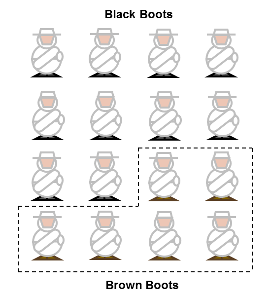
Next we’ll move onto the boots. Here’s where our first exercise in variation begins. Randomly select roughly a third of your figures and give them brown boots. Everyone else gets black boots. For my example, I did 6 troops with brown boots. Now your group of minis looks something like this:
For our next step, we’re going to be blocking in the main colors for the trousers and the jackets. To do this, we’re going to take our 16 miniatures, shuffle them up, and arrange them in a 4 x 4 grid. As we plan out our colors, we’re going to use four different colors for jackets (each individual color applied to all miniatures in the same row) and four different colors for trousers (each applied to all miniatures in the same column). For jacket colors, we’re going to use a dark grey, a light grey, a buff tan, and a light taupe (to represent raw wool or undyed canvas). For our trouser colors, we’re going to use a dark grey, a light grey, a brown, and a light blue (trousers either issued or more likely stolen off Yankee prisoners).
Before we start, however, we need to make a few alterations, because this step has a few caveats: first, we don’t want any brown boots in the brown trousers column. Secondly, if our matrix would lead us to use the same color for both the jacket and the trousers, we’ll substitute brown for the trouser color, which means we don’t want brown boots in those two spots either.
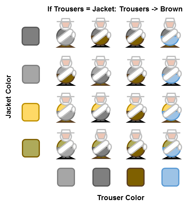
It is here that the sanity-saving aspect of the method becomes apparent, because once your miniatures are put into the grid, you don’t need to make any decisions about which colors you’re using on which individual figures. And already we can see the variability we’re getting out of using just a few basic colors.
At this point you might be asking, “Why no brown jackets?” The answer is because in addition to whatever bedroll your miniature rebel might have, he almost certainly also has straps across the other shoulder for a satchel or canteen. Those straps are generally going to be painted as leather, which is also going to be brown. Given that we want to make our miniatures visually distinctive, we want those little details to pop, so we avoid basic brown as a jacket color. But we’ll revisit this later when we talk about variations on the method.
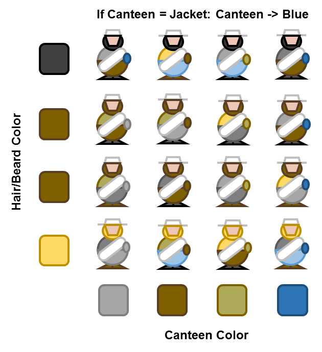
Now that we’ve finished the jackets and trousers to our satisfaction, it’s time to move on to hair and canteens. I do these next because I find that especially on smaller scale figures it’s easier to paint the hair and beards before I paint the hats, and this is as good a time as any to do the other bit of kit that is likely to vary in color – the canteens. At this stage, we’re once again going to shuffle our figures and place them into another 4 x 4 grid.
For the canteens (in columns), you might want to look at your figures first, especially if you’re painting larger scale minis; some of them will have “barrel” canteens made of wood. If I have any of these, I’ll typically pick them out and put them in the same column, but so long as you paint them in a wood tone you’re fine. One column will have their canteens painted blue to represent those made by northern manufacturers for the Union army – which were one of the prized items commonly looted by Confederate soldiers. The thing we’re looking out for here is whether the canteen matches the jacket color, and if it does we want to give that some contrast by painting it blue as well (because none of our jackets will be blue). This will usually give about a third of our canteens as blue, which looks good.
For the hair and beards (in rows), brown hair is most common among Caucasians, so I double up on that (though if your were feeling adventurous you could do one row of light brown and one row of dark brown, but I find that after the shading step there’s not much difference on my tiny 15mm figures). I then do one row of black and one row of blonde. To save time, my blonde is actually the same color I used for buff in the previous step. No need to watch for matches here, just apply whatever color you’ve assigned to the row.
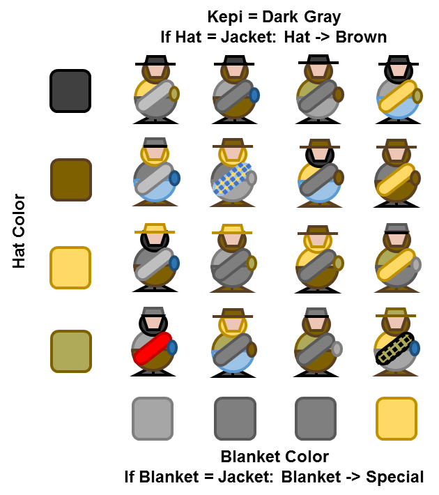
Once we’re done with the hair, beards, and canteens it’s time to move onto the best part: our tiny soldiers’ hats and bedroll blankets. Just as before, we’re going to take our miniatures and shuffle them up before once again rearranging them into another 4 x 4 grid. Along each row, we’re going to apply our hat colors: black, brown, buff tan, and taupe. Blankets will be colored along columns, with one of light grey, two of dark grey, and one of buff tan.
Just as before, we’re going to be looking for some special cases that alter what colors we paint individual elements. For the hats, the first thing we’re going to do is pick out any troopers wearing a kepi and paint those dark grey (with a black brim). In our example troopers in the illustration, there are four of these. The vast majority of kepis issued to confederate infantry regiments were grey, with other colors such as red being reserved for artillery or the more flamboyant Zouave regiments. The variable hat colors then are going to be used only on the slouch hats. And if we we ever find ourselves in a spot where we’d be painting the hat the same color as the jacket, substitute brown for the hat instead. I don’t worry about a black hat being next to black hair or a brown hat being next to brown hair as the hats stand out far more than the hair and beards anyway.
Finally, we’ll make a similar allowance for the bedroll – if we ever find ourselves in a situation where we’d be painting our bedroll the same color as the jacket, we will instead substitute a “special” color. This is your chance to throw in some visual flair with a red blanket or a blanket with plaid checks. Just something different to give the trooper a little pop of an unusual color or pattern. And if any particular figure in our batch doesn’t have a bedroll, that makes our job even easier! The result will look something like this:
If you want a little more color variation you could substitute taupe in for one of the dark grey columns, but be warned that will likely result in more “special” bedroll cases. But even without that our unit is looking positively piecemeal, with no real uniformity to speak of. With all of the large-scale variation complete, we can once again give our mostly-painted troops a final shuffle and arrange them into a nice double line to see the effect:
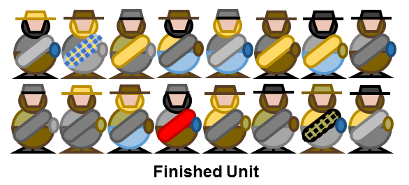
This exactly the kind of rag-tag look we want. Having gone through successive stages of “grid and shuffle,” no two troopers are the same, and most importantly we’ve ensured that we have good visual contrast by preventing large blocks of the same color from being adjacent to one another. This ensures that even for small figures the overall silhouette will be visible and distinguishable. Is it realistic that no trooper with brown boots also has brown pants? Absolutely not – but it certainly looks better on the tabletop, trust me.
By this point we’re down to the details, and if I’m feeling adventurous I’ll grab maybe one or two troopers and paint a pinstripe down the outside of their trouser legs – red, green, or dark blue if they have blue trousers or red, dark gray, or black if they have light gray or brown trousers.
At this stage, we’re done with all of the exercises in variation. This is the point at which I would paint all of the cartridge boxes and bayonet sheaths black, all of the shoulder straps and blanket ties leather brown, all the gun stocks a mahogany brown, and black out all the stuff that will eventually be metal (canteen cap, belt buckle if one is visible, gun barrel, trigger guard and hammer, and bayonet if one is affixed).
Once all of my non-metallic colors have been blocked in, I give everything a wash with diluted brown ink (like the ubiquitous Agrax Earthshade) to give the entire force even more of a worn, dirty look. For what it’s worth, I do this for Federal troops too – war is a dirty business. I do this stage before the metal because if you do it afterwards it can make the steely metal bits look rusty, and while the Confederates may have had to resort to bespoke clothing in place of uniforms, no army in the world allows its weapons to rust. Once the wash is dry, I go back and hit all the metallic bits with an appropriate color. Voila! The unit is ready to be based, varnished, and fielded!
Varying Your Variations
I have got a set of colors that work for me and I use them most of the time, but sometimes I’ll swap things up. Maybe instead of a buff color I’ll use a khaki color with a more greenish tinge. Or if I’m feeling particularly ambitious I’ll expand my grid to a 4×5 or even 5×5 and either add a few new colors in or replicate a color across a column or a row (usually light gray).
Also, remember how I talked about there being no brown jackets? Well if you want to do canvas straps for canteens and knapsacks instead of leather (and many were canvas) you can swap in brown jackets where you’d normally do taupe and use the taupe for all the straps. But varying your strap colors is one more thing you need to think about, so if I’m going to do this I’m going to do it for an entire batch. And if you’re varying things across batches, go ahead and shuffle between batches when fielding your troops, as that will further break up any uniformity.
Finally, don’t limit yourself to just the American Civil War. You can apply this same principle to any force that lacks uniformity. Though I used a different palette of colors I used this exact method for my Second World War Afrika Korps troopers, painting each 12-man squad in a 4×3 grid. It would also be appropriate for barbarians from the Classical Era or the Dark Ages.
Color Recommendations
Because I know people will ask, here are the actual paints I use:
- Flesh: Vallejo Model Color Flat Flesh
- Black: Vallejo Model Color Black with a drybrush of Vallejo Model Color Dark Gray
- Dark Gray: Vallejo Model Color Dark Grey with a drybrush of Vallejo Model Color Neutral Gray
- Light Gray: Vallejo Model Color Neutral Gray with a drybrush of Vallejo Model Color Pale Gray
- Brown: Vallejo Model Color Black Red or Craftsmart Espresso with a drybrush of Vallejo Model Color Flat Earth
- Taupe: Ceramcoat Mudstone
- Buff: Citadel Ushabti Bone
- Khaki – Vallejo Model Color Khaki
- Light Blue: Vallejo Model Color Sky Blue with a wash made from diluted Vallejo Model Color Andrea Blue – you could easily reverse these colors and do a light Sky Blue drybrush over Andrea Blue, but I like the wash effect better
- Medium blue (canteens): Folk Art Blue Ribbon
As you can see my blacks, grays, and browns all get a drybrush but my taupes, buffs, and khakis don’t. The reason for this is that I’ve found for smaller miniatures the wash is not always sufficient to bring out the textural detail on darker colors, and as such these colors really benefit from an extra drybrush stage to bring out the relief on the miniature. But keep in mind that I’m painting 15mm figures – if you’re painting larger miniatures you’ll likely want to do shading and highlighting with several related colors just as you normally would.
Conclusion
By using a method that limits the number of individual choices we need to make to just a handful, this process saves loads of time. Arranging our colors in rows and columns allows us to bring huge variation to our troops, but the limited number colors in our palette overall means that our force looks cohesive, like it belongs together. So go ahead, give it a try!