Welcome back! If you haven’t checked them out yet, don’t miss part 1 and part 2
This update marks two solid weeks of painting. Since the last update leather, gold bits, and the head received a lot of attention, in addition to tinkering with the main armor parts. All told, that is close to another eleven hours of paint time, bringing the total now to around twenty-two hours. I genuinely enjoy all that time spent slowly building up and adjusting the finish, otherwise I’d be doing something else! The process is going well but I still have this baseline of tension about getting everything done before the deadline.
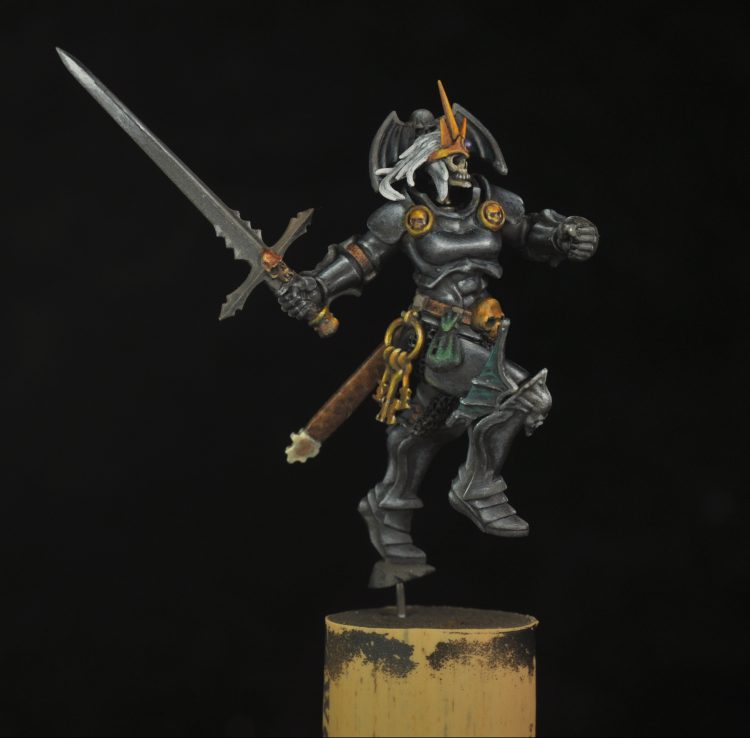
I was initially going to describe the paints I used and how, but it may make more sense first to outline my general approach to painting. For me, the specific colors used are less important than building up layers of paint to achieve a visual effect of texture. This is usually accomplished by building semi-transparent layers of progressively light or darker tones. This is done by mixing paints together in small amounts to adjust how dark or light they are. If I didn’t have one of the specific paints I used, I would just be mixing something that looks similar to achieve the same overall effect. This isn’t a linear process either, there is a lot of adjusting light and shadow along with smoothing transitions.
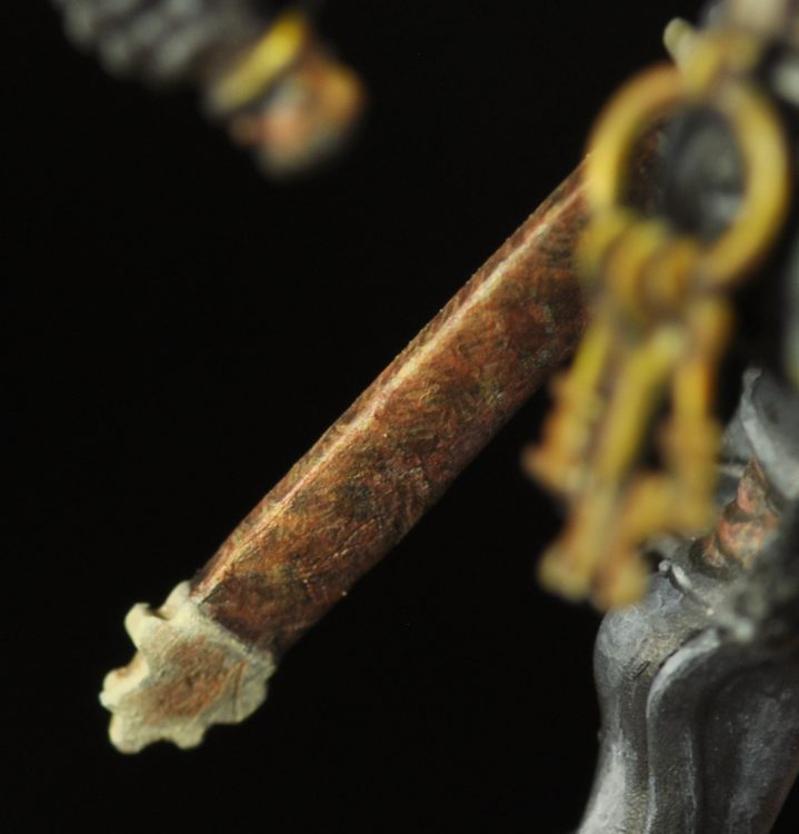
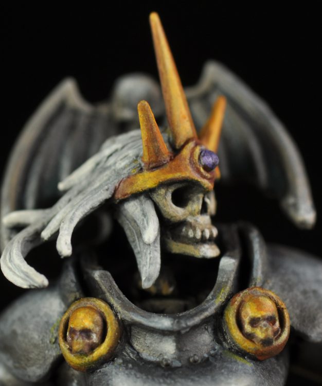
At the last update most of the leather was still brown base coat with heavy lines of Zandri Dust marking out rough shapes. Next a wash of black paint thinned with water was applied to the darker areas that were outlined. Doombull Brown was used to smooth out the transitions. The main effect was achieved by doing a pattern of tiny lines. There are around three to four parallel lines of a color in one direction then done in different direction in another spot. This was done with dark and light paint mixes to give a nice overall texture.
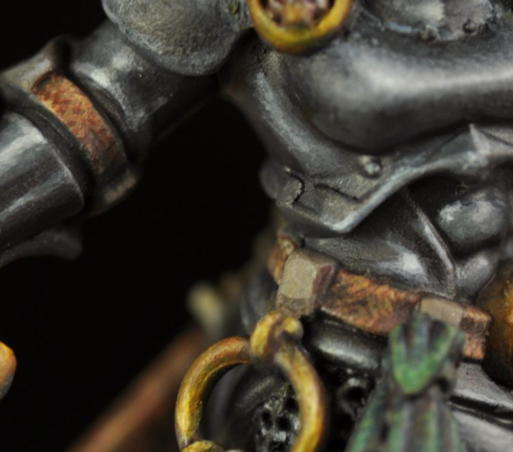
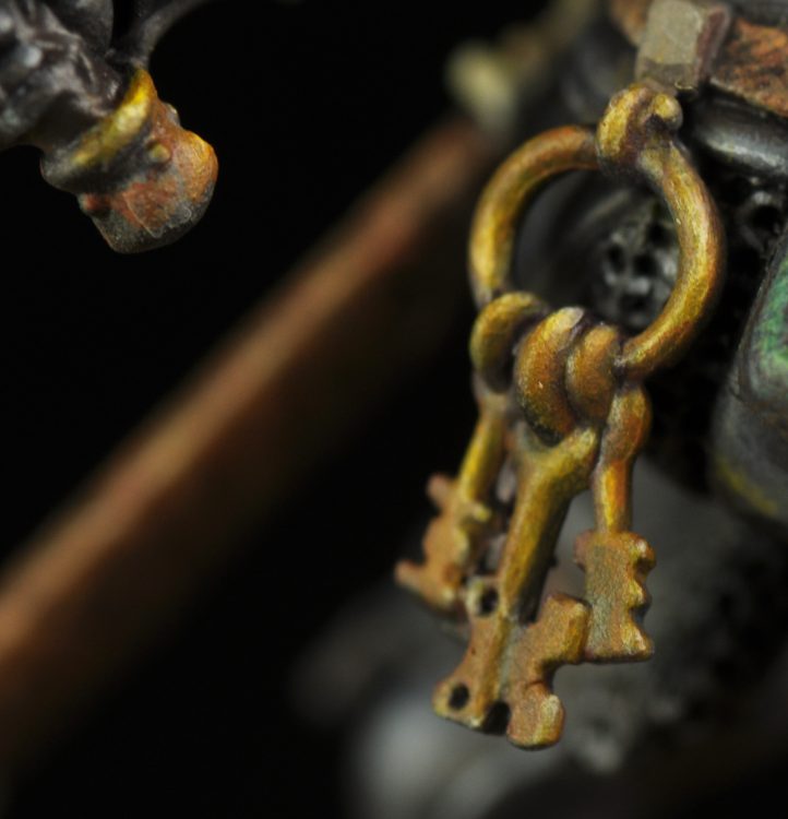
The gold was done by building up layers of Doombull Brown mixed with more and more yellow for the lit areas, then pure Vallejo Sun yellow, and then a Sun yellow and white mix. Yellow is great for this because it’s so thin that getting a glaze consistency is easy. The recesses were hit with a thin, almost wash consistency, Vallejo Model Color violet. Finally glazes of Sun yellow mixed with Vallejo Orange Flame were used to increase the color saturation. This is done because mixing white tends to desaturate color. The crown could still use some work to build up white reflections and deepening the brown.
That’s where I’m at currently. In future updates I’ll show off my painting progress as the model comes along, and talk about the techniques I’m employing and some of the challenges, so be sure to check back in a week or two. And if you have any feedback, hints, or questions, feel free to drop a note in the comments below or email the Goonhammer team at contact@goonhammer.com.