The Warhammer 40,000 universe is a massive place, and the “Narrative Forge” hobby articles encourage thinking outside the box (literally) when putting models together and stretching yourself out in the hobby. They aim to make hobbyists and players comfortable growing beyond imitating the models they see in their Codexes and playing the rulebook missions, and serve as a source of inspiration for anyone wanting to forge new experiences in the hobby. This week, Tyler “Coda” Moore is talking about figuring out how to paint your narrative armies.
Dearest viewer.
So.
You have your narrative vision (which I talked about last time — click here for that).
You have the force pictured in your head.
Now you have to answer the big old question of:
“How the hell am I going to paint it?”
Well, good news! That’s our topic today. A method you can answer that question with is:
Research -> Test -> Execute -> Evolve
In true (i.e infuriating) style, this means that the process of figuring out how to paint your army will require you will have to ask even more questions to find your answers.
Here are the questions you’ll want to ask yourself, and answer:
- Why are you going to do it that way?
- Researching sources
- Determining common themes/a motif
- Cracking the code
- What details will promote the narrative you are trying to tell?
- The devil is in the details or identifying key features
- Show, don’t tell the narrative
- Don’t forget your bases!
- How will you execute and refine the scheme?
- I imagined, I painted, I created.
- Expanding the painted narrative on the go, I.E for the love of god take notes
Why are you going to do it *that* way?
Let’s start with our bog stock trooper. The core of your army. The tiny person that you will paint anywhere between 10 and 1000 of.
How are you going to colour him in?
If we take a quick step back to the narrative vision that we talked about last time (in fact if you haven’t read it, have a quick squiz as this is definitely part 2 to its part 1) and you may already have a rough idea of what colour you are going to paint the damn thing. If not, that’s ok, this is where you are going to figure it out. If you are lucky enough to have a solid idea, this is where we will refine it for the tabletop.
Researching Sources
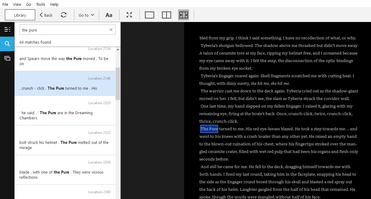
Note that the Pure have red lenses. Something I missed on my original source check as I swore they where mentioned to be green. Whoops. Book is Spear of the Emperor by Aaron Dembski-Bowden, you can buy it here.
We’ll start by researching sources. For some armies this can be easy as opening your codex, for others like pure homebrew creation this might be a tad bit trickier. Let’s look at those narrative army types we broadly defined last time and talk about where we could find sources for our colour scheme.
- Historical Works
If you have selected this, then crack open your book(s) and start taking notes. Look for references to armour colour, trim, symbols, heraldry, weapon descriptions and the like. If you are basing your army off a Black Library book, then you are in luck, the kindle versions have an insanely nice search feature. Sites like lexicarmum and the 40k wiki are good sources for getting details as well, don’t forget to check the article’s sources for more data to mine.
- Homebrew Creations
This is where it gets tricky as you are effectively the source material. My advice here is to start somewhere solid. Pick a single colour that you want to use and start pumping out test models (more on that later) to figure out a colour pallet that works. If you are working on something like a custom space marine chapter, look to canon sources on company markings, placement of heradly and the like to form the basis for your ideas. What I’m getting at here is the universe of 40k has thirty years of material to work off, so don’t be afraid to crib off the existing source material. Also look to history for inspiration and as always don’t forget the colour wheel aka our rainbow god.
- A Themed Army:
Themed armies could be considered a more generalist take on historical works, so the same general idea applies here. However if you aren’t cleveing to an exact time frame or source (i.e a black library book) you can take inspiration from the homebrew creation and put a slight spin on the standard paint scheme.
- An Army Built For A Specific Narrative Event Or Game Type:
An event army or game type narrative army really draws on itself to inform the paint scheme.
This is hard to explain but picture the poster boys of Games Workshop, the Ultramarines 2nd Company, decked out in their blue with gold trim. Now picture it in a desperate zone mortalis mission, fighting in a space hulk. How has that scheme changed? How can you show that on the models? Do you weather them in a certain way? Now picture that army in a 6 month long jungle fight scenario, similar to the historical Vietnam conflict. How does it change compared to baseline/the zone mortalis example? What would you do differently to show these armies are fighting in vastly different climates. That’s the crux to this kind of army.
Determining Common Themes/A Motif
TheChirurgeon: Before you start painting your army, you should also think about how you are going to apply the army’s scheme to make it your own, including the additional visual details you get to decide. What visual aspects are you going to use to signify your army’s narrative aspects, and how are you going to tie them together across multiple models of different types and sizes? So, two steps here:
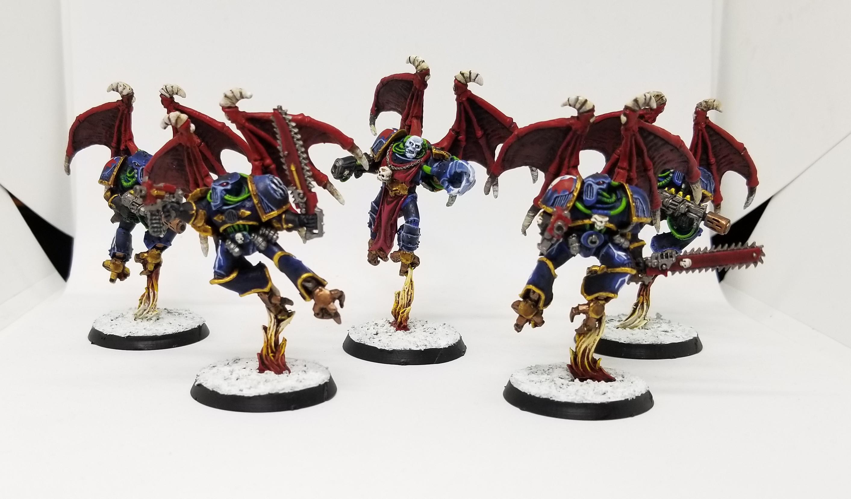
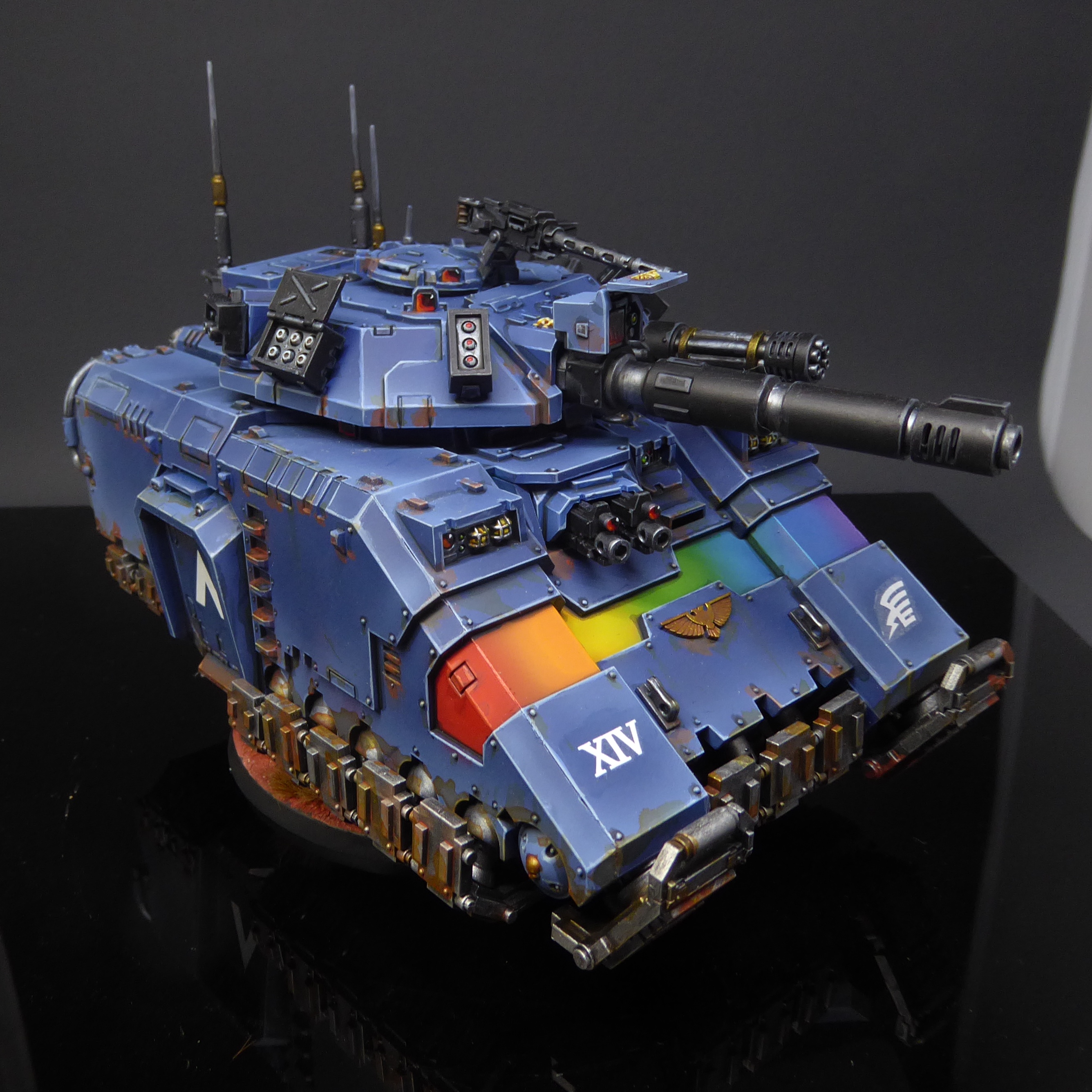
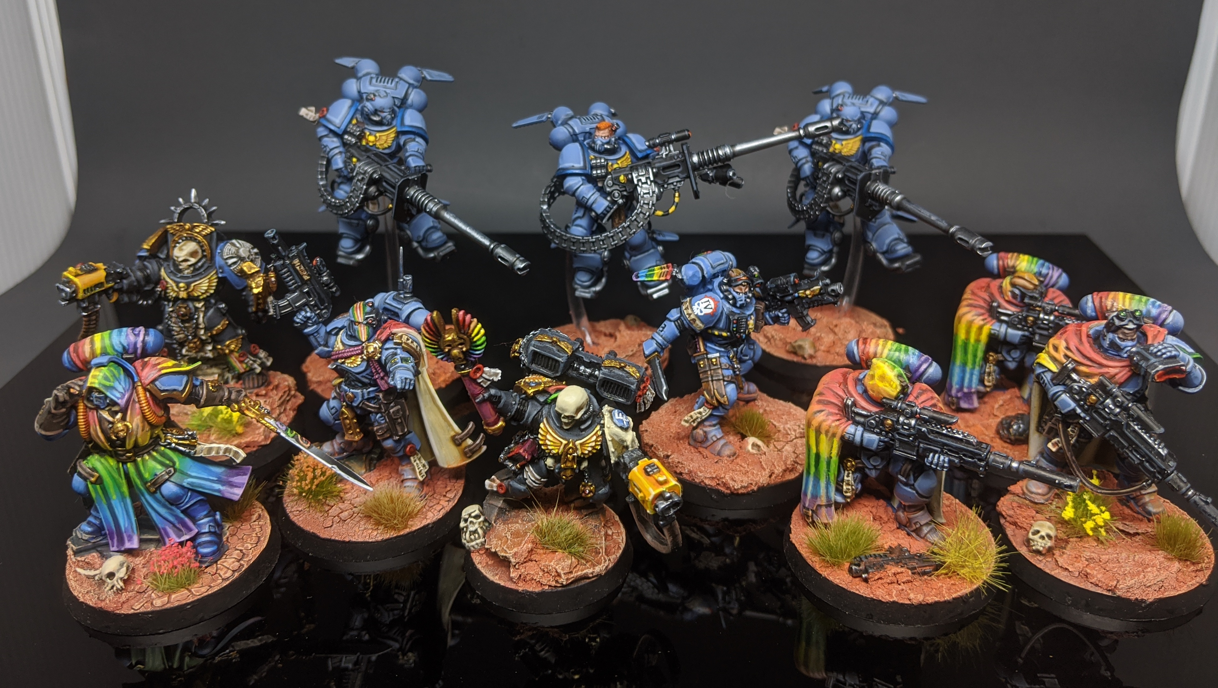
- Determine the visual aspects you’ll be applying to the force. This can be something simple, like the rainbow gradient that MasterSlowPoke uses for his Rainbow Warriors – it’s not present in the original Rogue Trader era art for the chapter, but it’s something he can add that’s really visually striking and makes them pop, or it can be something more complex, like a camouflage pattern and add-ons that you’ll be applying to the army based on the warzone you’ve set them up in. One of the coolest armies we’ve seen is Seyni N’Diaye’s Carcharodons, which borrow heavily from Maori and Polynesian trial art, and applies those patterns to the whole army. These details are added in white, and because they’re so strikingly unique, they allow him to paint armor of different colors in the same army that are visually unified by their tribal markings. For my Night Lords, I decided early on that all of my Raptors and Warp Talons would have warp-mutated wings instead of jump packs. This has made sourcing 2nd edition metal Tyranid gargoyle wings a pain 20 years later, but it both looks great and lets me give the models a pop of red color.


Credit: Robert “TheChirurgeon” Jones - Determine how they’ll be applied across all of your models. Once you’ve determined the common visual thematic elements for your army, you’ll need to figure out how they’ll be applied. Coda’s going to talk more about color in the next sections but this is more about where and how you’re going to apply your special elements. Here I’d suggest that a little goes a long way – you want your narrative visual elements to be obvious enough that they tell the story and tie the force together visually, but not so much that they overpower everything else and leave your models unrecognizable. Going back to MasterSlowPoke’s Rainbow Warriors, he chose to apply the rainbow gradient pattern to the kneepad of each Intercessor, keeping the effect small and simple on the bulk of his army but making it visually obvious. But when he has to apply the same motif to other models, he’s got more options, and that’s where he has to decide where to apply the gradient and how much is too much. For his Repulsor Executioner, that meant finding a large area of panels where he could apply the gradient without having it take over the entire tank. For his Eliminators, the cloaks were the obvious choice. You can make these decisions on a model-by-model basis, but you should think about how much is “too much” for your army’s extra thematic details and spot color choices before you start going hard, if only to avoid painting half an army before you realize you don’t love the scheme.
Cracking The Code
Alright. We have done the research (or have picked a ‘cool and good’ colour) and are ready to crack on with the army. Now you need to see if it actually works.
Grab a box of easy build troops. Closer to the actual models you are going to paint, the better. Come up with 3 or so different ways of executing your idea and try it. These attempts could be as simple as different painting methods in order to figure out how to hit that balance of speed:results or if you are starting from scratch, a place to figure out what colours will and won’t work together.
Are you think that process sounds a little vague?
We are going to investigate two methods here which I’ve totally made up the names for. Namely a method for pre-planned schemes called the “Test Swatches method” and the later method called “Pray to your rainbow-coloured god…. method.”
Using Test Swatches to Select a Colour Scheme (or the “Experience and downselect method”)
Let’s say for some totally legitimate, cool and good reason you want to take the colours of a specific steam train and whack it on your space marines.
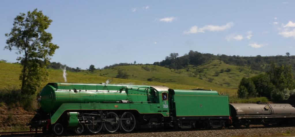
Behold. Our subject. So we have a colour scheme. In this case green and yellow but we don’t know the exact colours to use. For the next bit you’ll need a bit of paper and a pen.
Take each colour you are using in the scheme and dab it onto the paper, along with your possible trim/spot colours (think eye lenses). This will let you see how the combination looks. Then after this down select to a few strong possibilities and paint some models. Check the the example below:
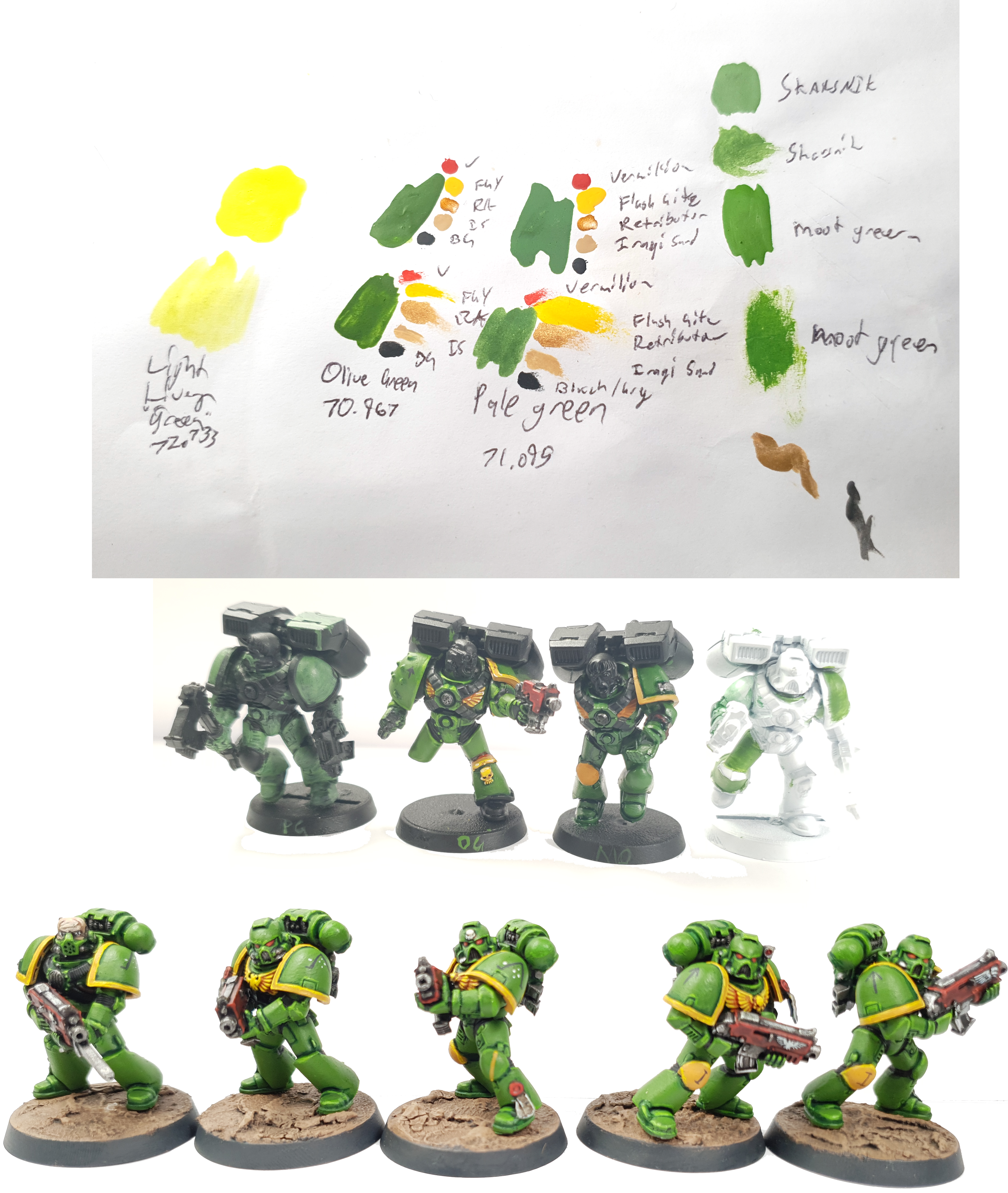
Again, this works when you have a pretty good idea of a scheme but I needed to refine what colours would make it work. I had a bunch of yellows and greens on hand to try, so I used the bit of paper to get an idea of what they would look like, picked my three faves, transferred them onto some primed models and started painting them. As you can see, I went with Pale Green, Olive Green and Medium Green.
Note how I’m not finishing each model. Pale Green was the first colour to drop. It didn’t match up with the type of green I wanted, so I progressed further with the others, finally I dropped the Medium Green after I washed the green washed the model and more or less completed the Olive Green test model. Then decided to try it on a white primed model, which failed pretty hard within a few armour panels.
What I’m doing here is using a combination of experience and down selecting. The experience half lets me chop down the possibilities of what green to use to 4 permutations, while the downselect lets me get it down to a clear winner. If my experience was shallower or I had less of a firm idea in my head, I would have lined up more test models or in the reverse situation, I would have had to paint less of them.
While you are doing these tests, keep an eye out for spaces to put campaign markings or little details that you can seed the narrative in on the model. Shoulder pads, knee pads, shields and weapons are good places to sneak details in, but more about that later.
Ok. So we have a basic theory to run with if we have a solid idea. For times you are feeling less sure, we’ll let’s get a little more advanced.
A More Colour Theory-Based Approach
Behold this and weep, for it is our new rainbow god.
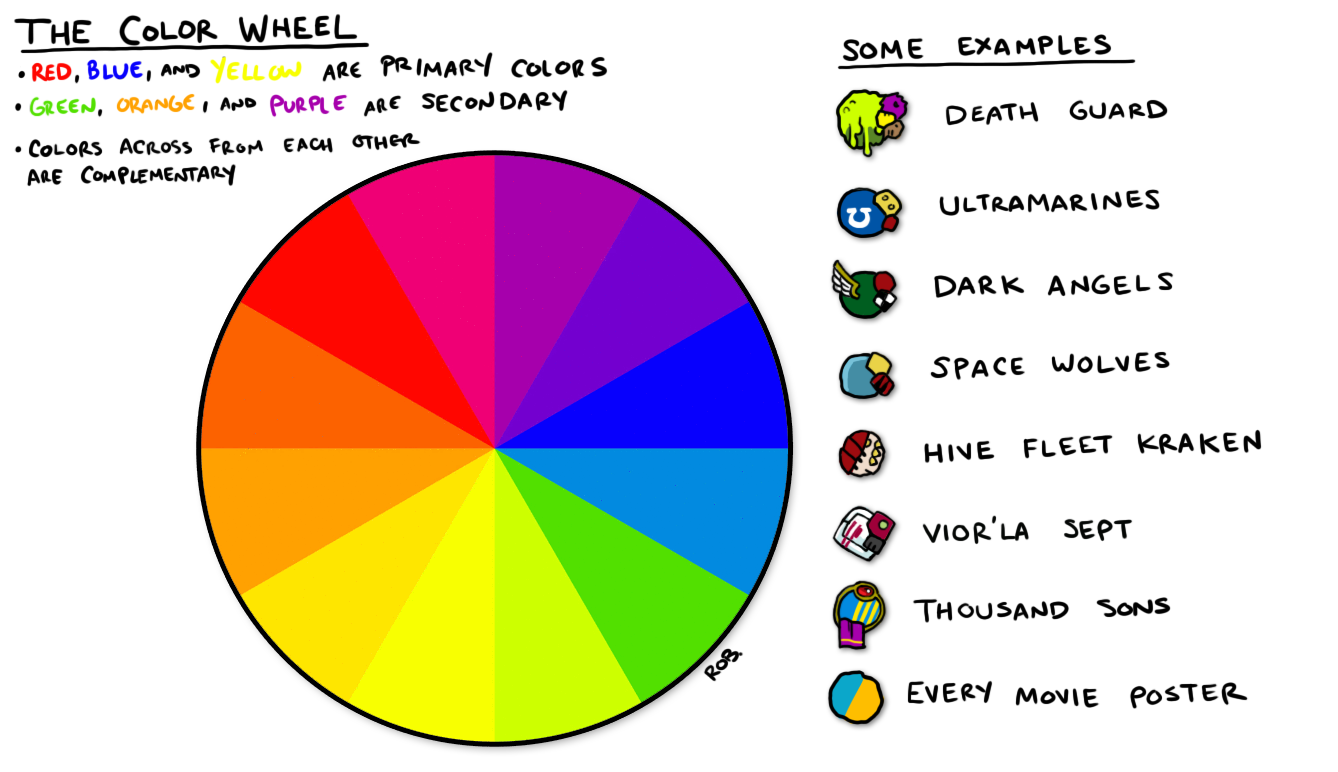
I kid, you don’t (and shouldn’t) need to be a slave to the colour wheel, but it can save you a lot of time, heartache and test models. Nor do you need to completely understand it, just realise and accept that it indeed does exist. Check out the examples Rob’s got on there. See how the colours look ‘right‘. That’s something you can work your scheme towards.
Let’s put the wheel to practise. Enter the internet and witness my two part cheat code for finding cool schemes:
Part One:
Jack aka Booley showed me this thing about a year ago when I spent 2 months saying “I DON’T KNOW HOW TO PAINT THIS KNIGHT HELP MEEEE” at the top of my lungs. It will help you see where each colour lands on the wheel and automatically spit out delicious visual data.
To make this work we need to upload a sample or at least find out it’s hex code of a colour we like. Bolter and Chainsword have some excellent resources, here, for example this thread of citadel hex codes will let you punch them into the Adobe Colour Wheel site. Seriously google “XYZ brand paint hex codes” and you’ll find them. Muck around with them until you settle on the colour your are going to paint the majority of your model with.
Part Two:
So you have that core colour we mentioned? From there you can explore and mine Analogous, Monochromatic, Triad, Complementary, Compound and Shade schemes (I’m reliably told that these are important things, check out this quick guide for more) for ideas to your heart’s content. Again, you don’t need to take these are gospel. Just muck around with them and let the ideas come, then do a test or two.
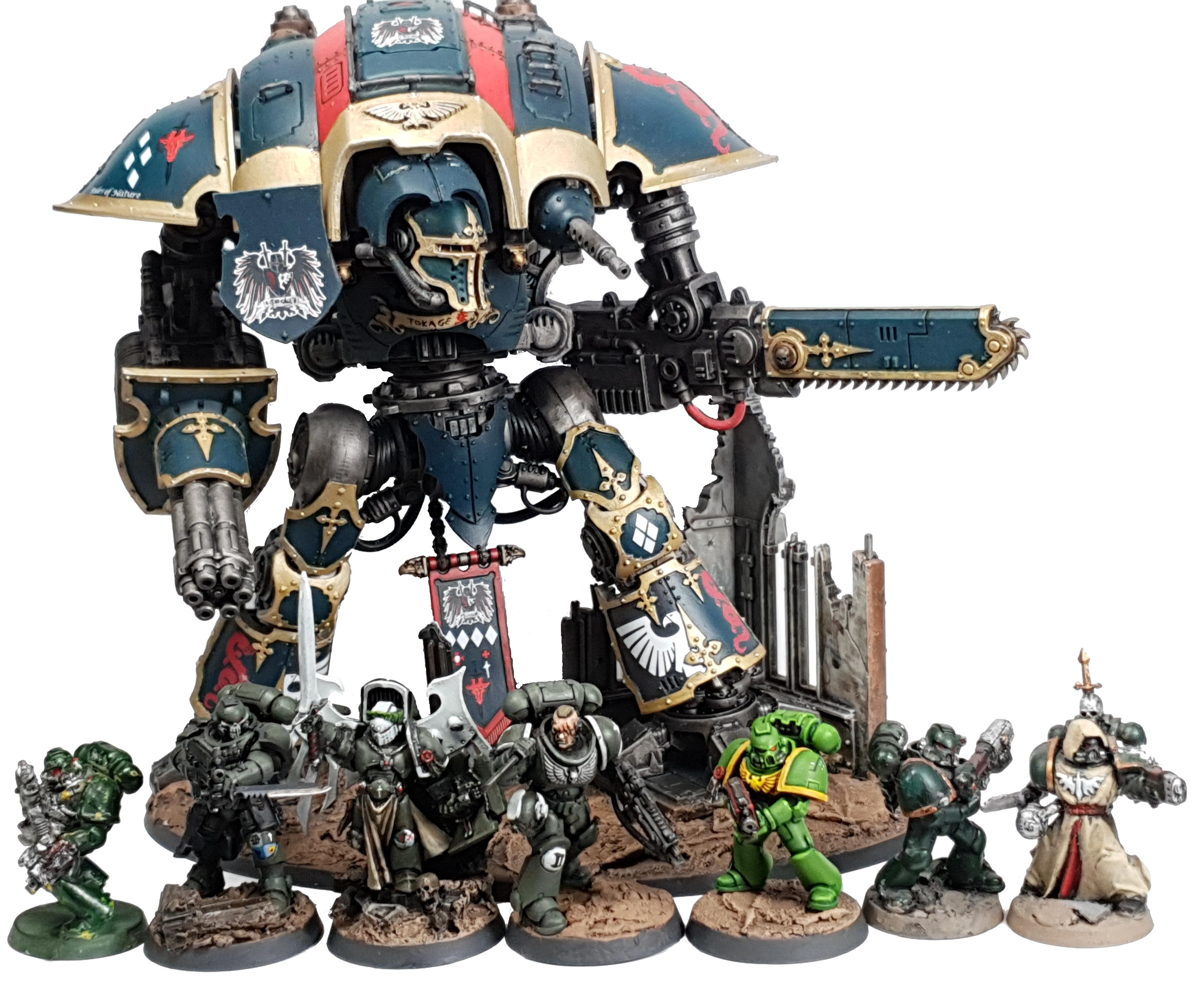
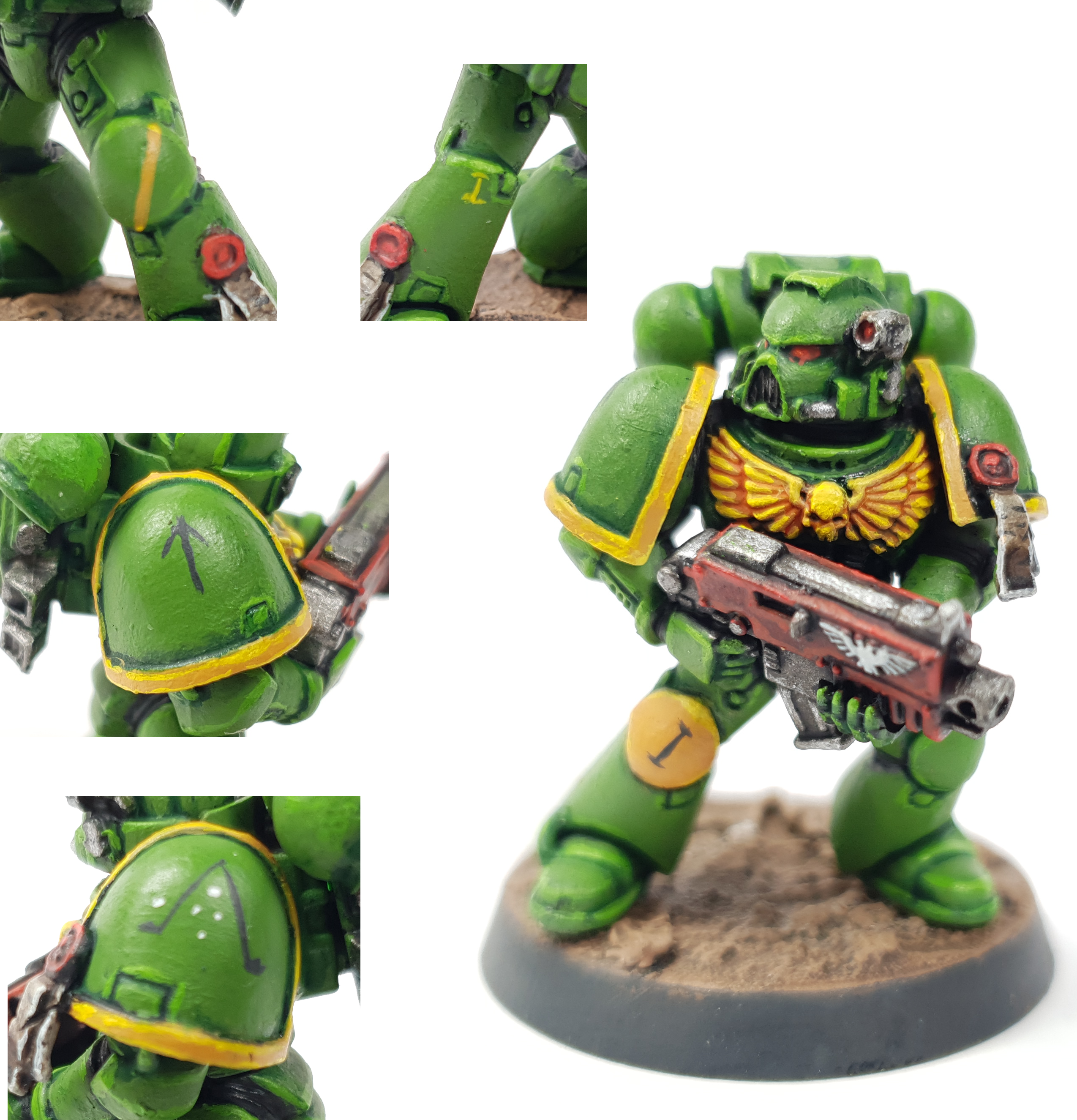
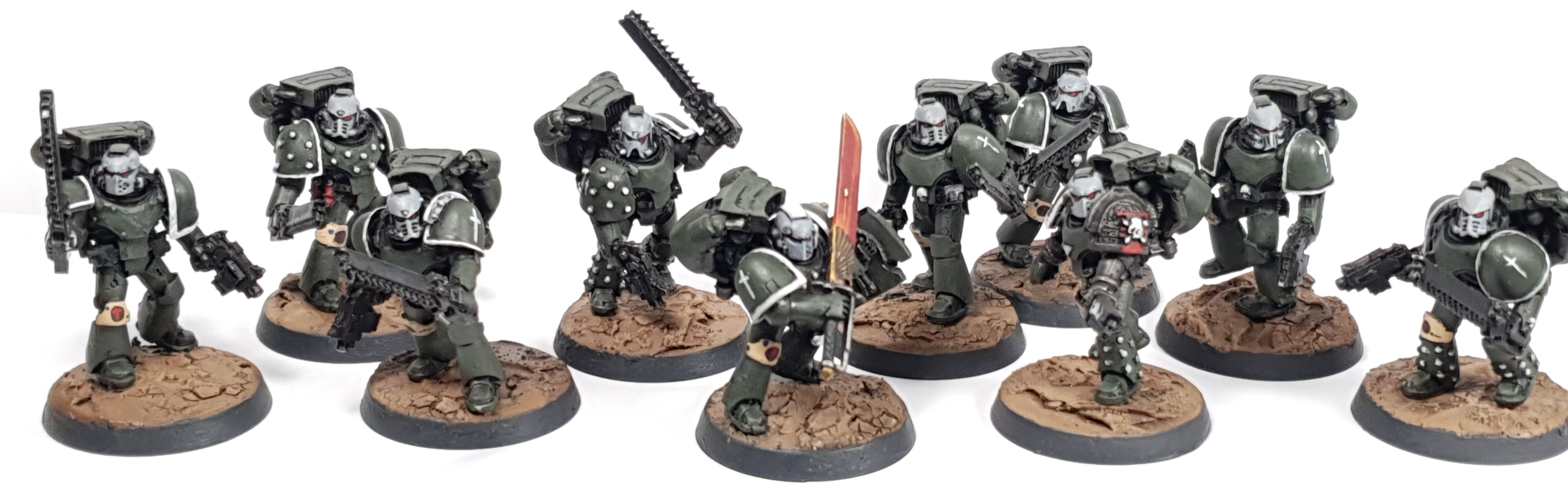
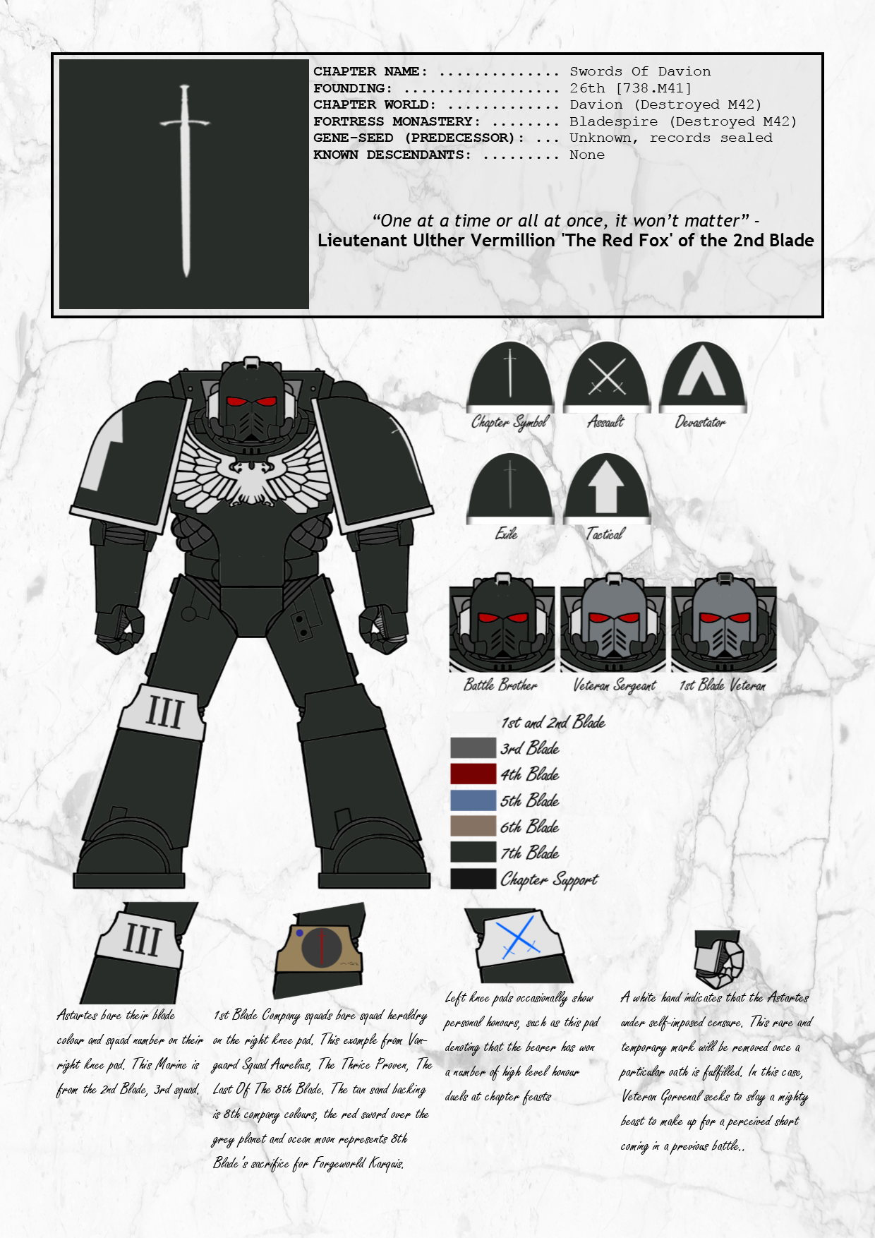
We used the Swords of Davion for an example in the last article. Let’s breakdown the scheme and show my working:
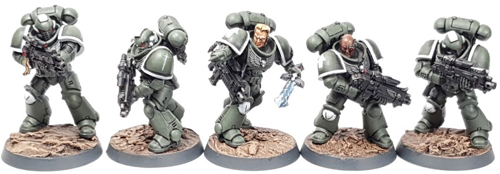
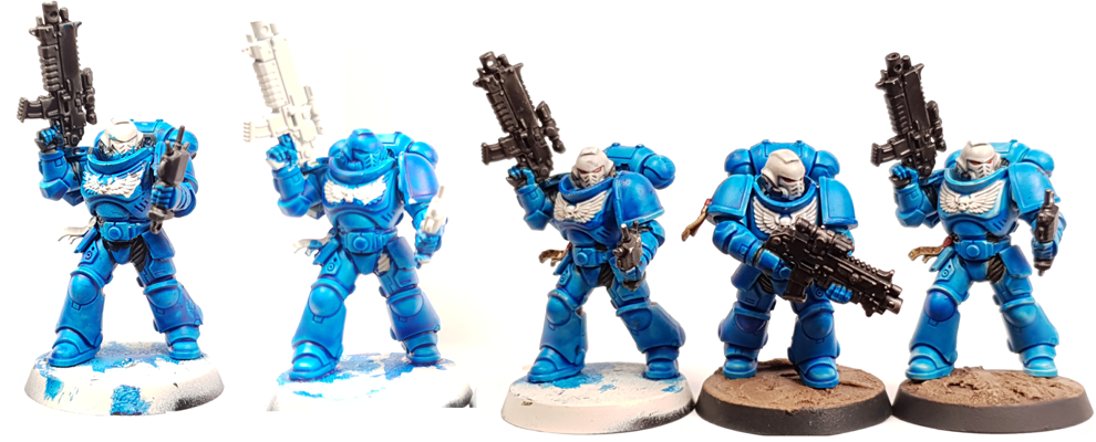
Vallejo Model Colour Yellow Olive is my fave colour to paint with. So when it came time to paint marines again I definitely wanted it as my primary colour. The previous version of the Swords had this colour with black trim and grey/red spots.
Compare the two pictures and try to ignore the (hopefully) vast improvement in painting. See how the black grey/greens are all blurring together compared with white trim details on the marines above? This is something that I wanted to avoid on the MKII version of the Swords.
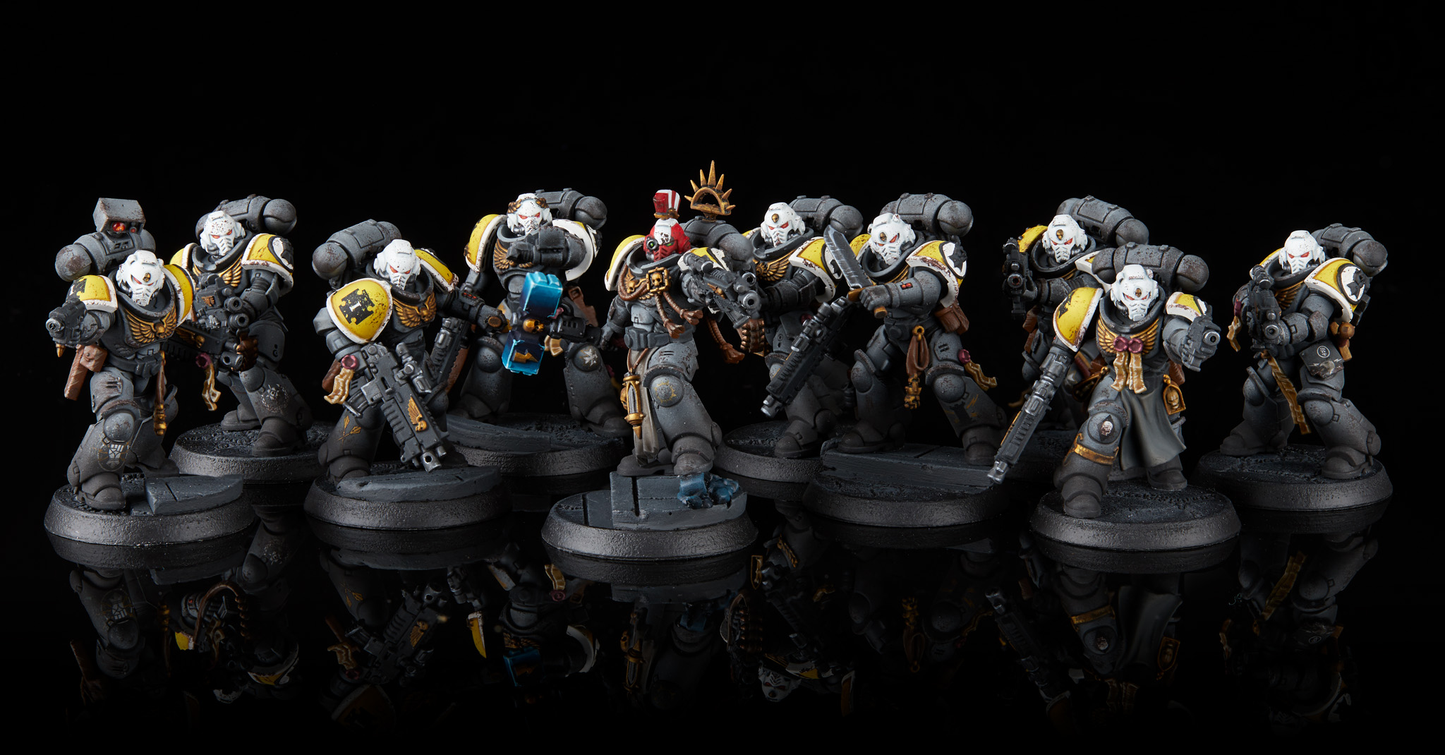
So I put my thinking cap on and painted up a number of test models, trying out various trim colours of red, black and grey, while also exploring the new Primaris sculpts. White ended up being forerunner, I also found that the distinctive crest/ears part of the helm could be picked out in white to get a call back to ancient troops, like roman legionaries or knight’s crests. I also started figuring out how to show what company the troops came from and where squad markings would be present. Given that the white helm/trim really made the green ‘pop’ I needed to keep that in, so therefore I went with the right knee pad. I also spent time figuring out how to show squad leaders, veterans and the like and turned to the codex for ideas. I ended up coming up with a quick system based on the helms.
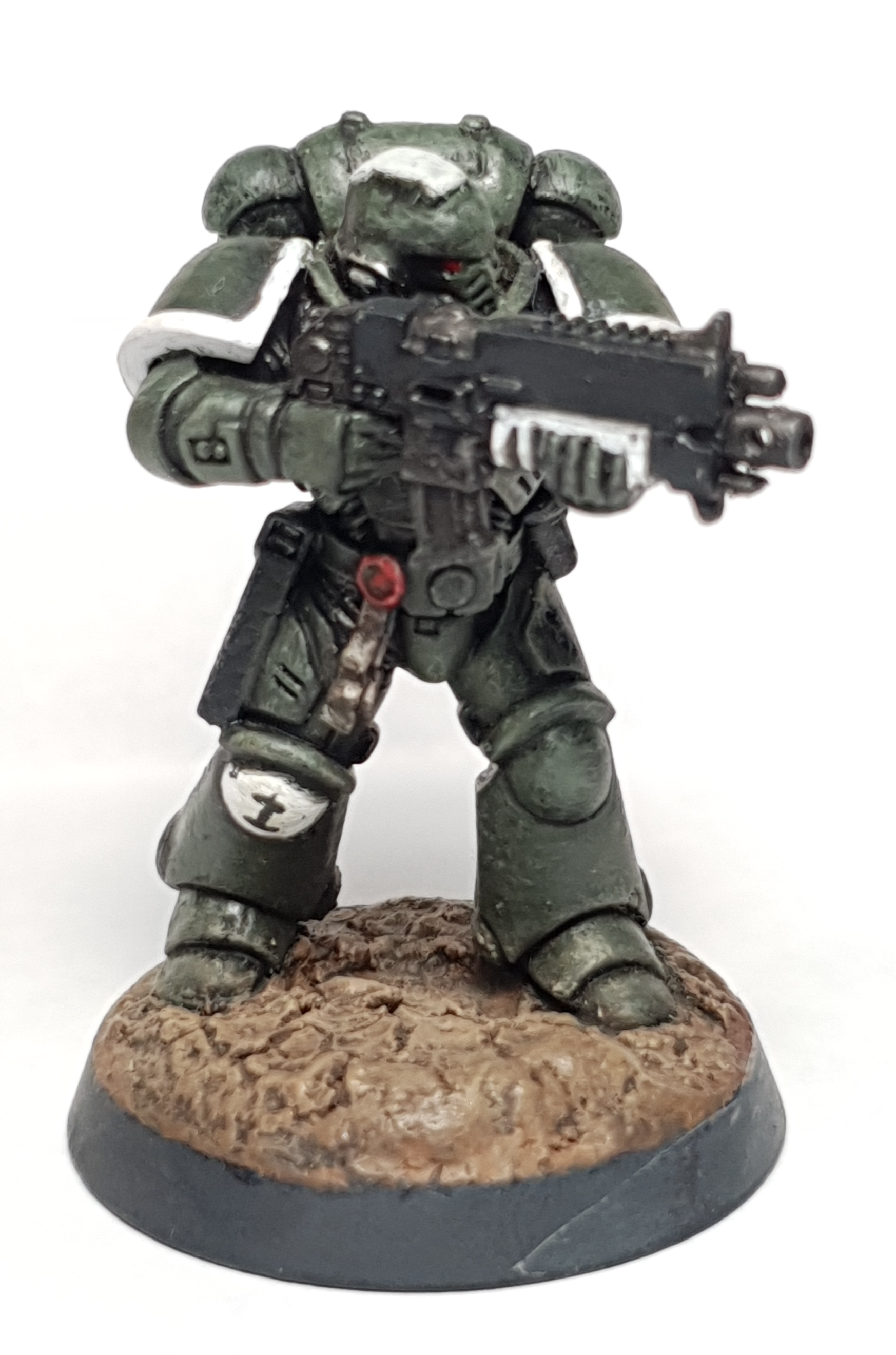
This guy is that test model, I ended up abandoning the white segment of the bolt rifle to save time but allowed him to keep it to honour his place as the 1st of the newly forged Swords of Davion. Also don’t worry about the test schemes that didn’t quite work out as they have a way of popping back up fro later use. For example I recycled the ‘classic’ sword scheme for my Swords of Davion Kill Team as the black felt more right for covert ops.
Let’s look at another example, which is more on the “pray to your rainbow god” side of the equation use the Adobe tool.
Picture this very, very hypothetical scenario:
Hypothetically, say if you did have a mighty Imperial Knight you were looking to plug into your homebrew marine chapter, that may or may not be the Swords Of Davion, you could upload a shot of your marines and then use the POWER OF THE COLOUR WHEEL to figure out a scheme that is different but meshes well with your marines. Alternatively you could spend 8 weeks fretting about the scheme.
Hypothetically.
Yerp. Totally a hypothetical.
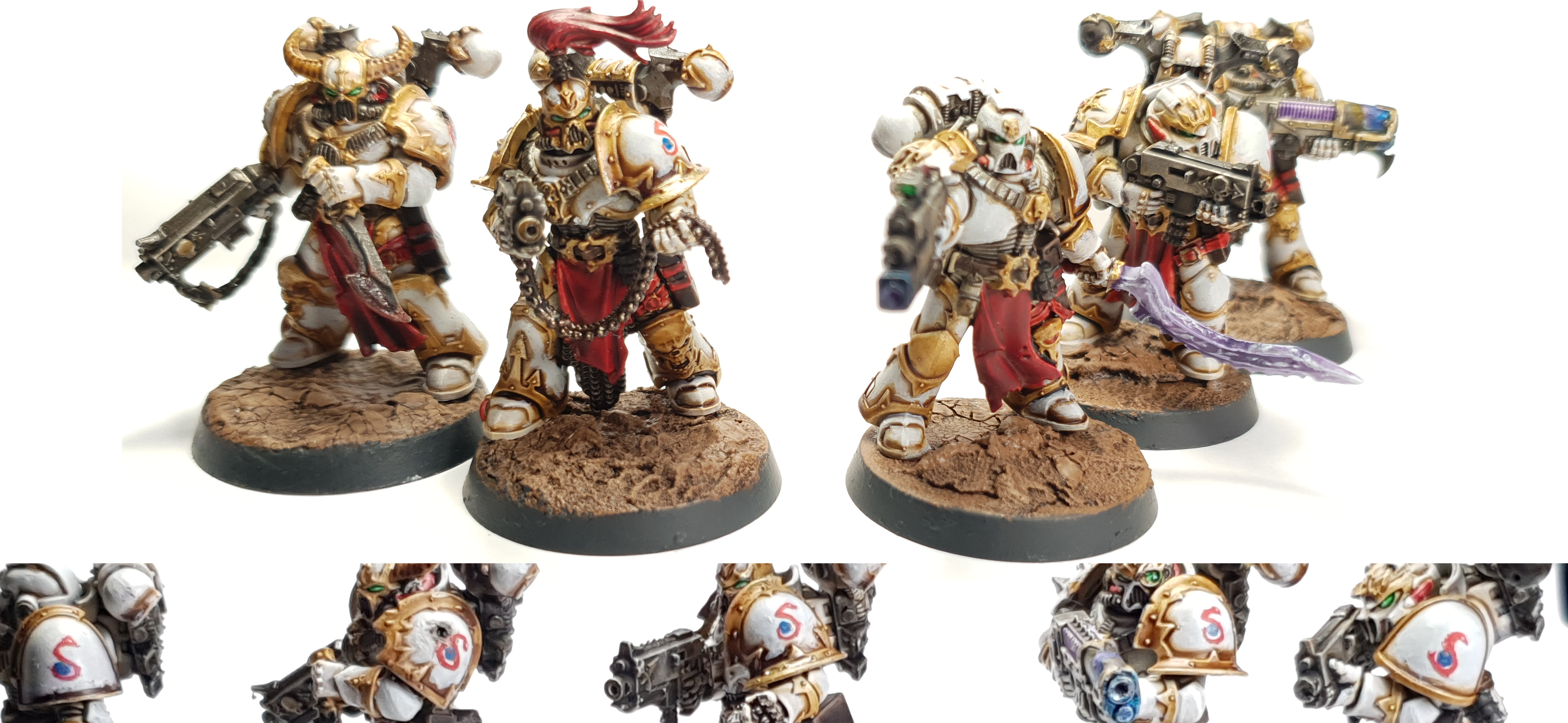
But seriously, I used the colour wheel to get a ballpark colour, which ended up being Incubi darkness. Then using some extremely sketchy math, I decided if Incubi was similar to my armour green with less yellow in it, I could “add” that yellow back in with some light gold trim. This would also match the trim on my Dark Angels if I ever decide to resurrect them. Furthermore I could tie the House to both my marine chapters with the red spot colour. Homebrew people take note: This is how you can come up with schemes from scratch that work and compliment each other.
What details will promote the narrative you are trying to tell?
Ok. So we have our basic scheme. Now we need to punch it up, after all…
The Devil Is In The Details aka. Identifying Key Features
I hinted about this a few times earlier when I talked about kneepads and shoulder trims. Key features like this are a great potential narrative canvas for you to tell your armies story on and will expand off the springboard of our basic scheme.
We have already consider how you can show the company/regiment/campaign your troops are in, so now think how you can sell that they are in the particular part of the setting you are exploring. A great example of this is a player in my local store. He has started a necron army and is using the crackle texture paint on the model’s shoulder pads to show that they are breaking out of/made of the sandstone around them. This neat trick creates an instant narrative theme that he can explore and continue with the army.
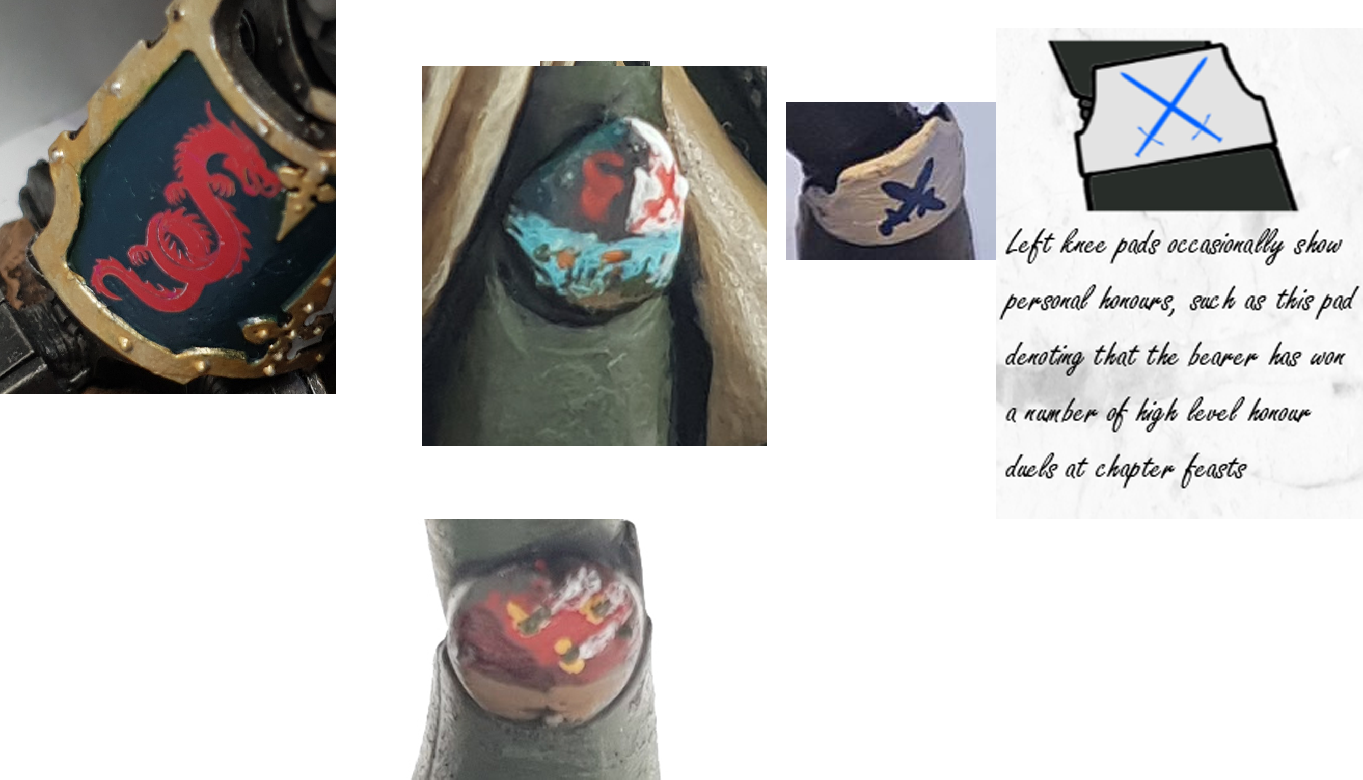
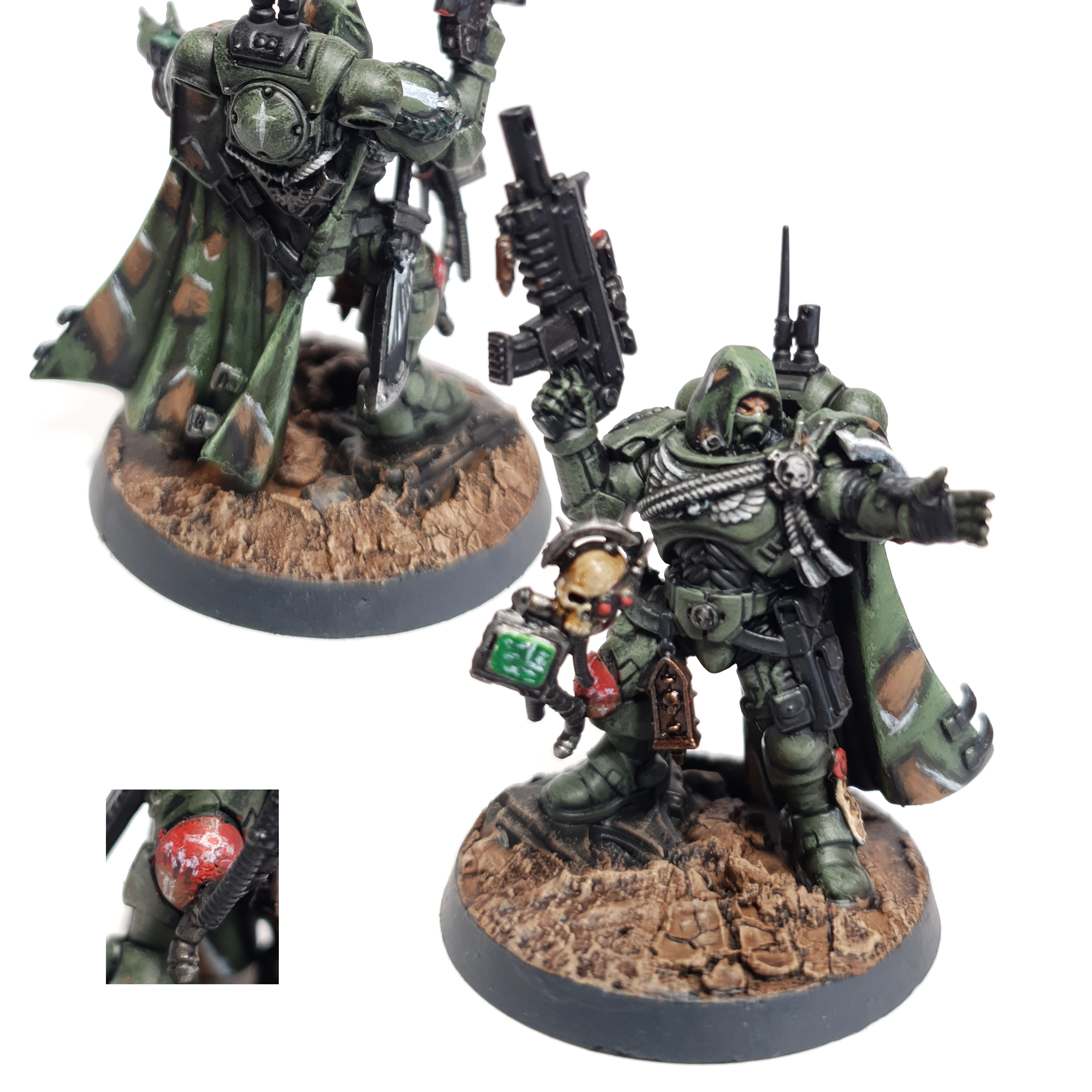
Other neat key features are the little bits of life you can put into the models. What I mean by this is graffiti on tanks, heraldry that harkens to the deeds of your noble heroes, scars and battle damage that tell a story. The Swords are pretty developed so I’m going to step back to a project still in its infancy. Let’s look at the Australius marine again.
This chapter is blatantly, “what if Australia and the 2000 Olympics, but space marines.” and for now clocks in at a massive 5 models. However look at the narrative detail on them. I’ve warped the tactical marking to be Broad Arrow, which is frequently used in military moto shirts in Australia, while the chapter logo is a stylised Australian flag with a Greek Lamba. Finally I have a company and squad marking on the kneepad and a way of showing demi squad leaders. With this I’ve got a strong start to play around with if I choose to expand the chapter in the future.
Once you have a few key details, don’t stop exploring the sculpts. There is always a new trick you can try to sell the narrative you are trying to tell. On that note this even goes hand in hand with posing the kit.
Which leads me to my next point:
Show, Don’t Tell, Your Narrative
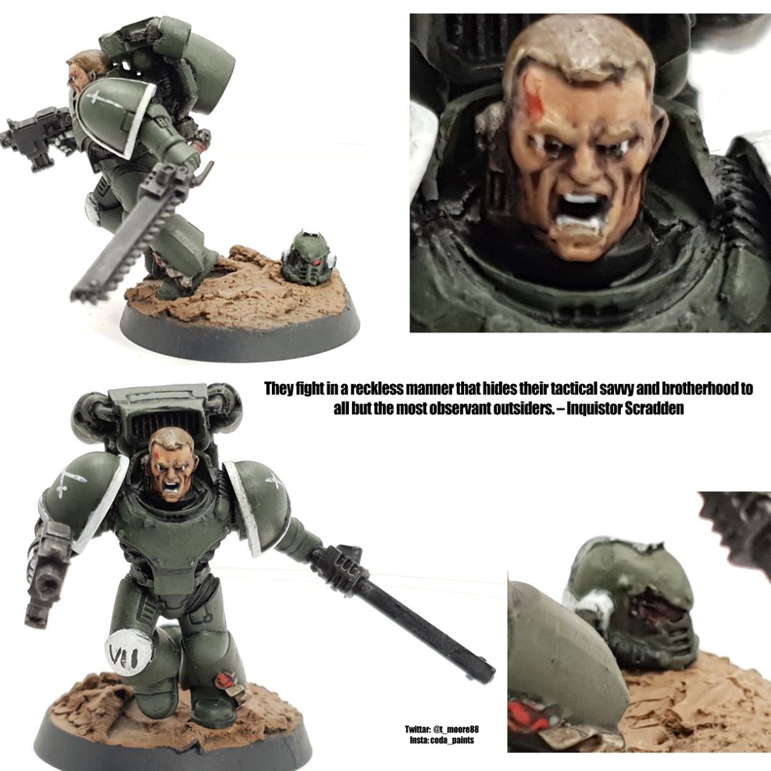
Check out the model above.
What does it tell you about the army narrative wise.
Now look at the squad. What further context can you infer.
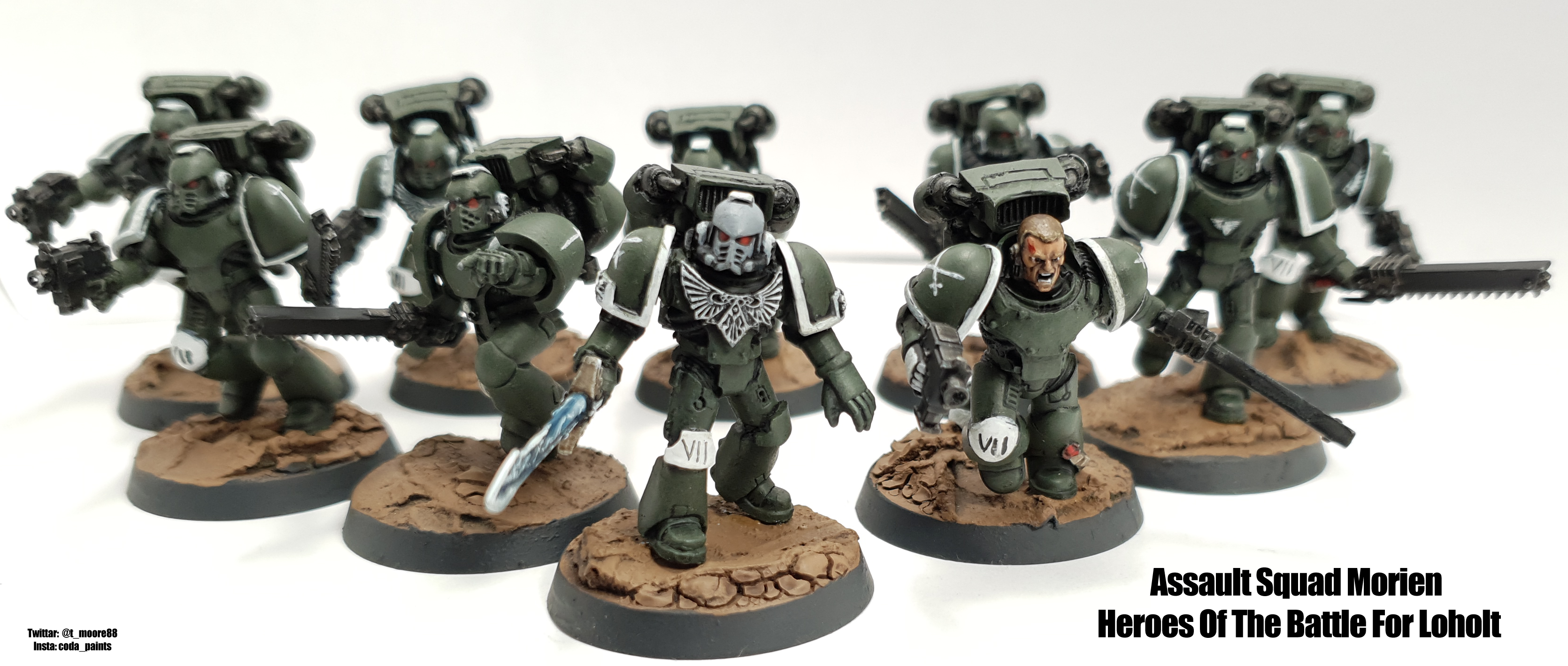
Compare them with this squad. Look at the poses, the colour used on the key points and the armour.
What makes them different.
What can you then infer just by looking at them.
The bog stock assault marine squad vs vanguard veterans is my attempt at telling a story narratively though my colour scheme and how I built the Forge World assault marine kit and (hopefully) does the whole “show don’t tell” thing.
This concept is important. While writing page after page of background for your army is an awesome experience, it won’t be effective on the table top unless you can express it through the models. Consider the tools you have to do this. It’s going to come down to A: How you build them and B: How you paint them and C: How you build the army list.
This why identifying key features and getting to know the models matters.
Don’t forget your bases!
On that note, one of the key features of your model is the thing they are all standing on. The bases.
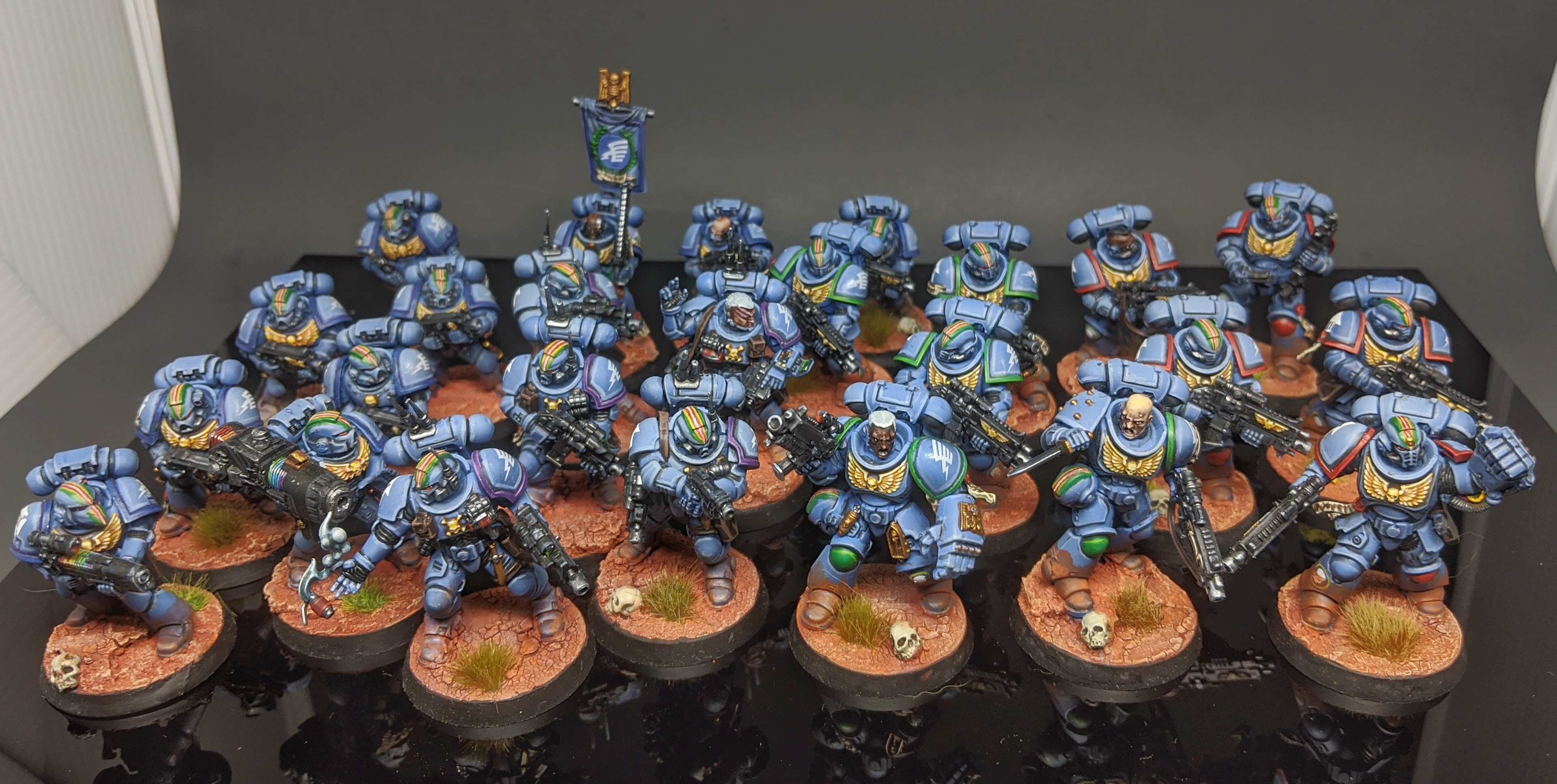
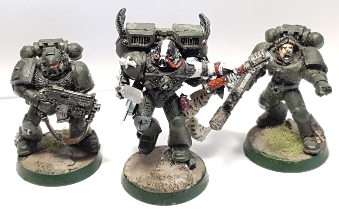
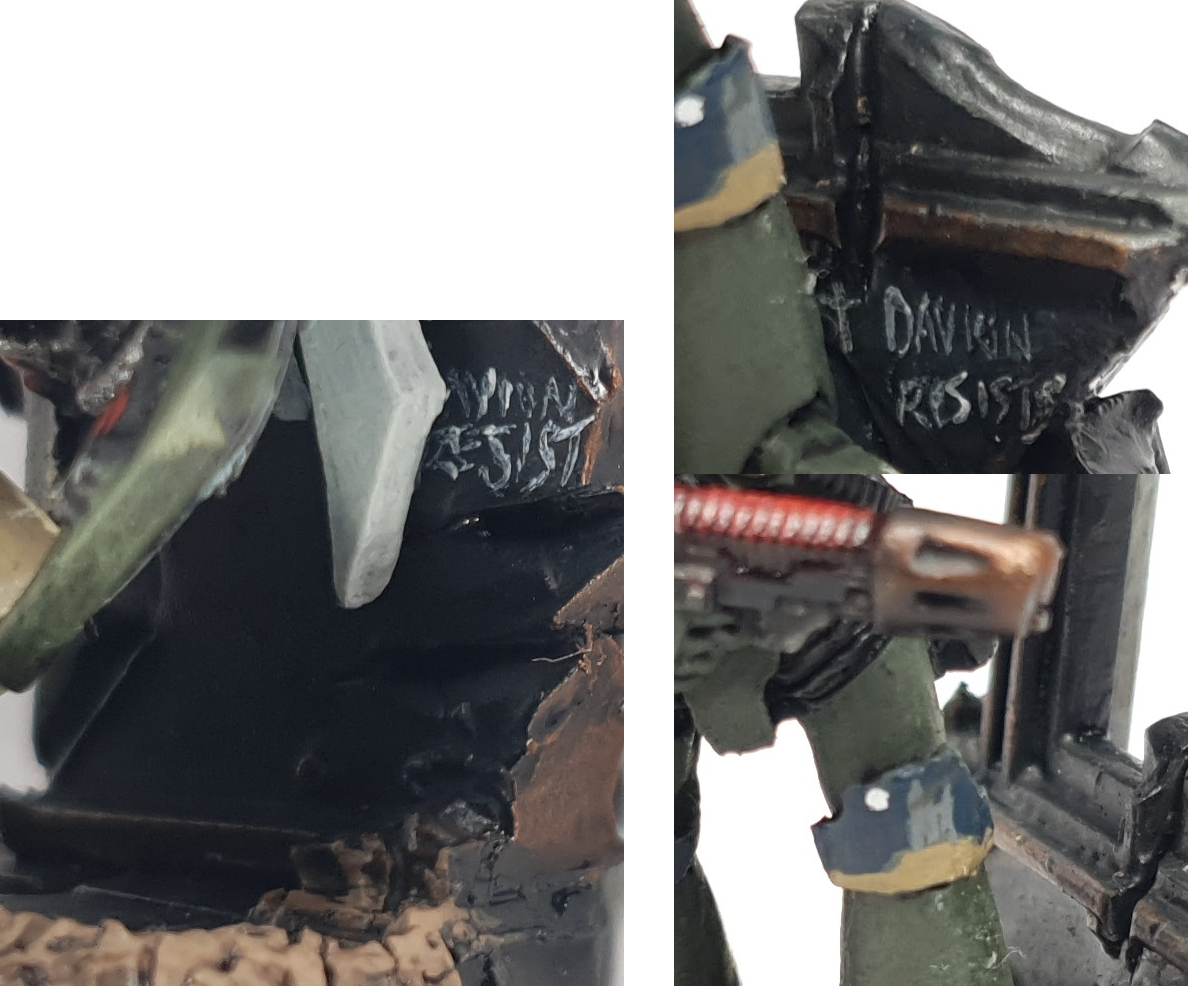
Never ever forget those vitally important plastic discs. They are the literal frame for your artwork. I’ve written an entire article about this which you should check out here, so I won’t wax on about it other than to say that it’s a cool and good thing to spend time on them. For example of a quick trick featured in that article, you can link armies together narratively by common basing, see here on my take on The Pure, which links them back to the Swords of Davion.
How will you execute and then refine the scheme?
I imagined, I painted, I created.
So. We have Id’ed a bunch of key details. We have a basing scheme. We have a paint scheme that has basic narrative beats in it.
However, maybe you are worried that you can’t come up with the heraldry for a character or you have run out of creative steam.
Fantastic. You should get started. Seriously. Get painting.
I’m not kidding, just start putting together the models and getting paint to them.
Don’t stress if you don’t have Captain Cerdic of the 2nd Company’s personal heraldry and backstory set in stone yet. Just put together a blurry image in your head and start building him. Maybe do a sneaky head swap and start converting the model. As you paint, continue to reference your background research material and let his backstory come to you and then put in the key details. If you have done your homework and have that basic scaffolding in place, things will seem to neatly fall in as you go. If not, leave a spot blank, waiting for inspiration to strike.
I’ll give you an example, using, you guessed it, Cerdic. Note the heraldry of his scouring of the traitors that dared to try and defile the sacred cherry forest of Davion Secondus. I came up with this after finishing the model and saying “Shit. I need to put something there.” I was then distracted by YouTube and ended up watching that bit of the Last Samurai where they talk about cherry blossoms. I decided then that LT Cerdic leading a bunch of Phobos teams in the forests around the Bladespire would be an appropriately cool moment for him to earn his promotion to captain and then set about painting it.
Expanding the painted narrative on the go or: “For the love of god take notes”
A downfall of this research -> test -> execute -> evolve method we have just talked about is that you have to remember a lot of stuff and that stuff is going to change as you go. If you are going to do your narrative force justice, for the love of god take notes.
I’ve already posted a picture of the cheat sheet I made for the Swords but to be honest you don’t need to go that far. A simple google doc or a forum thread where you upload pictures of the models/notes as they are completed is more than enough.
Anyhow! That’s enough of my rambling for a day.
Credit @LordTwisted
If you have your own narrative army or have thoughts about coming up with colour schemes, want help or just a want a chat, comment on this article or shoot us an email at contact@goonhammer.com . Also you can find us on the Goonhammer Facebook page, or tag us on Twitter or hit something with the #goonhammer tag.
As for me you can find me:
Twitter – Where I post models and like things!
Insta – Where I forget to post models and sometimes like things
Twitch – Where I stream painting models and make a fool of myself for fun.
Have fun
CODA AND OUT